
My first product design lesson
Something can look good and still be entirely incorrect
I am not a designer by any means, and that is one of my biggest issues while working on Membrant. There is a big difference between defining user flow and features and cranking out something that actually looks polished and makes the user feel something while they use it. So I did what most people in my situation might do and turned to AI. And it gave me something that looks pretty decent.
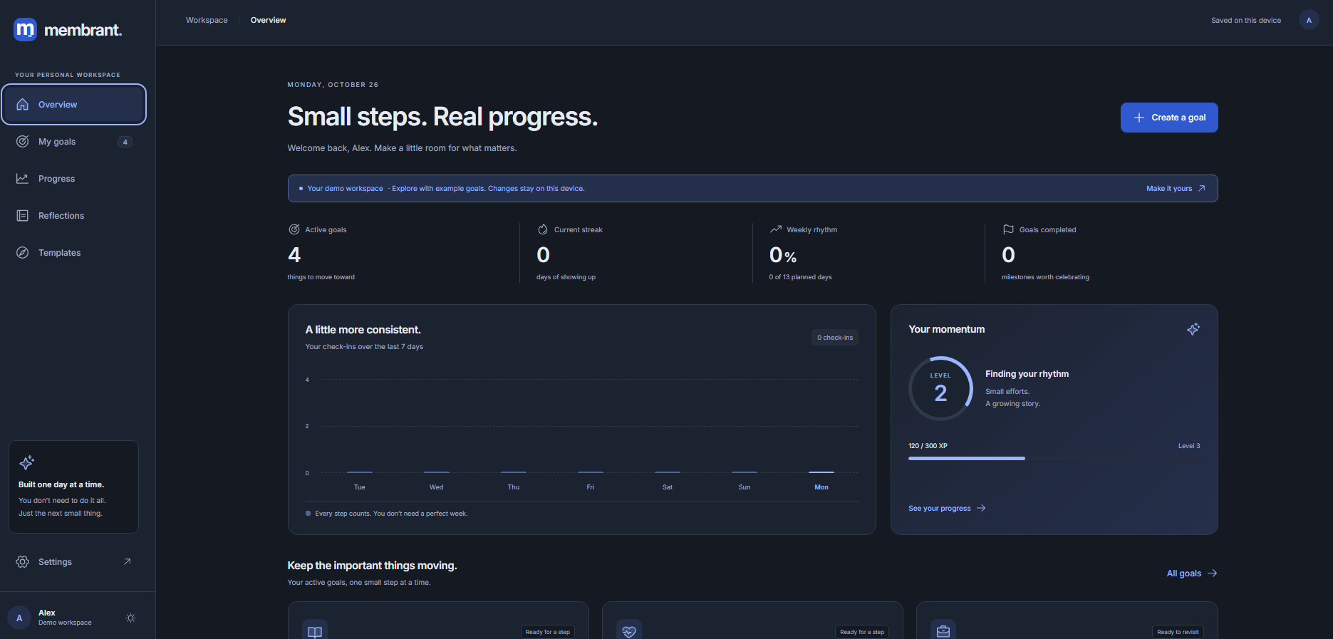
Objectively, other than looking a little bit vibecoded, this doesn't look to bad. However, what I learned is that something can look good and still be entirely incorrect for your app. And I learned this because I hate looking at this design. My goal platform made for helping people grow and manage all the things they want to learn and achieve looks like a cookie cutter corporate SaaS, and using it feels like I'm using Jira. Very much not what I'm going for.
So using this as my jumping off point, I worked backwards from this design. I found it way easier to just have the AI spit out some bullshit and then I decide what I like and don't like and go from there, rather than designing something from scratch, and I think I will use this kind of approach from now one. But the main thing I thought about this time is not just look but feel. I saw a video about the IOS design system and how they made it to invoke feelings, and I tried to incorporate that.
I wanted the app to feel natural and personal, so I scrapped the analytics and tried to give it more of a notebook feel. I even added a quote section where something that the user wrote in their journal will be on the dashboard to kind of help them kind of reflect on what they wrote/get in the headspace they were in when they wrote that. So, with all that said here's the new dashboard prototype:
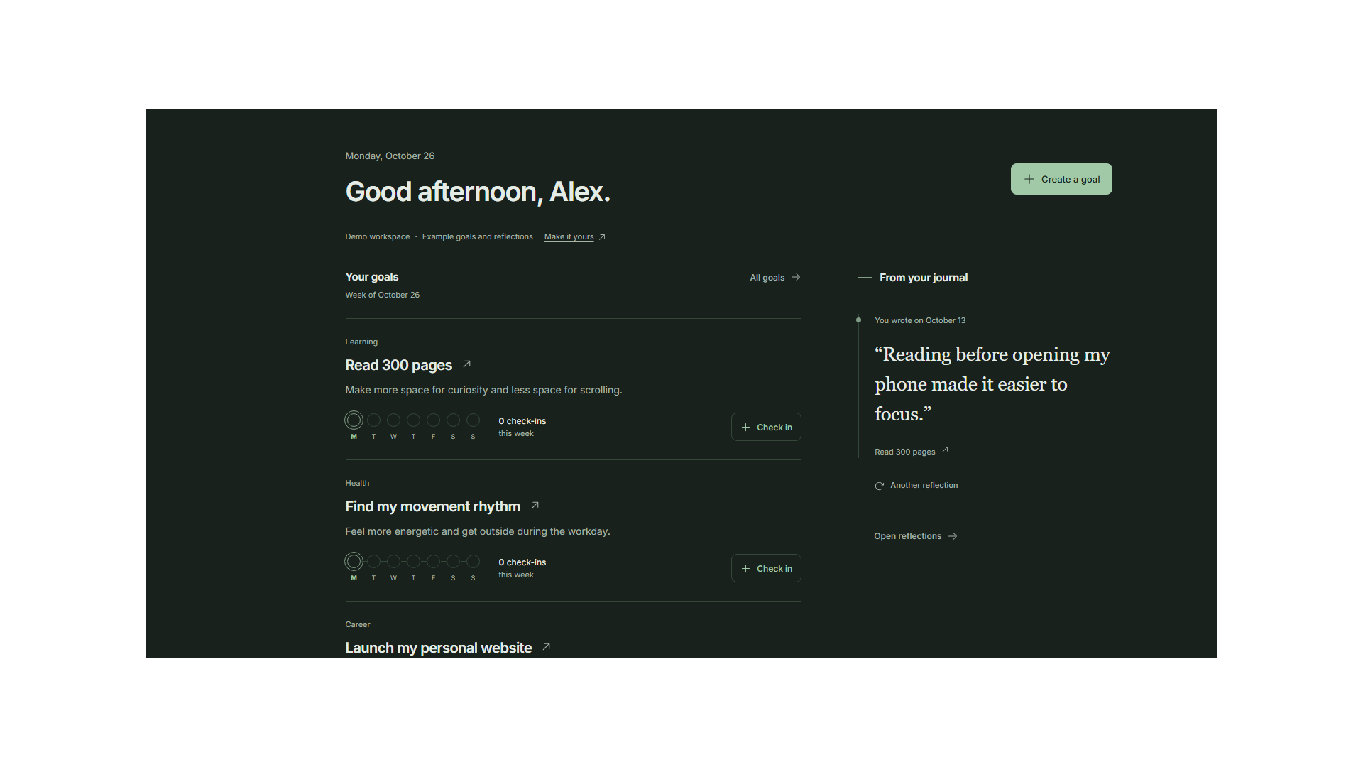
I personally think this is way better, maybe too heavy on the greens, but that can be tweaked. I think I'll update the rest of the app to look like this, both mobile and web and see where to go from there.
The main takeaway here is that I figured out how to move away from just generic cookie cutter SaaS designs, which is all I know and move towards something a little more genuine and that fits how I want to feel when I use the app. Not perfect yet but I thought this was a lesson worth writing about.